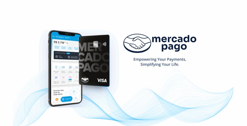
Empowering Your Payments, Simplifying Your Life.
Mercado Pago is a leading digital payments platform in Latin America, offering secure and convenient financial services like online payments, mobile wallets, and point-of-sale solutions. Part of the Mercado Libre ecosystem, it empowers millions to manage transactions seamlessly, whether for shopping, paying bills, or running a business. With a user-friendly interface and robust security, Mercado Pago is a top choice for digital payments in the region.
My Role
Senior UX UI Designer / Senior Product Designer
- My responsabilities
- UX Research and user Interviews
- UI Design and Prototyping (Low fidelity (Wireframes), Medium fidelity, and High fidelity)
- UX Metrics
- Heuristic Analysis
- Cross-functional Collaboration
- The Problem Identified
Users were losing financial control due to lack of visibility over their recurring subscriptions
Lack of Visibility:
Users didn't know how many active subscriptions they had or when they would be charged
Difficulty Canceling:
Complex process requiring users to leave the app and contact each service separately
Distrust:
Perception of lack of control over spending generated insecurity about financial management
Payment Failures:
25% occurred due to insufficient balance at the time of unexpected charges
Business Impact:
High churn rate and low engagement with the digital wallet
Design Thinking Process
Empathy: Immersion in the User's Universe
45 in-depth interviews with users | Behavioral data analysis of 10,000 transactions | Complete customer journey mapping
Definition: The Core Problem
Problem identified: Lack of effective tool to manage subscriptions | Goal established: Provide visibility and total control over recurring payments
Ideation: Co-creating the Solution
Co-creation workshops with multidisciplinary stakeholders | 15 concepts explored and evaluated | Chosen solution: Centralized Subscriptions Hub
Design Thinking Process
Prototyping: From Idea to Interface
Low-fidelity wireframes to validate main flows | High-fidelity interactive prototypes in Figma | Focus on clean interface that conveys security and simplicity
Validation: Testing with Real Users
Usability testing with 30 real users | Users completed tasks 60% faster compared to previous methods | 92% approval from participants
PROCESS OUTCOME
Validated solution that balances technical complexity with ease of use, fundamental for success in fintech
The Solution: Subscriptions Hub
Applied Design Principles
Simplicity • Transparency • Security • User Empowerment
Measurable Results
💡 The impact was significant for both users and the business, validating the user-centered approach
-25%
Reduction in Payment Failures
Users alerted before charges
+40%
Increase in Retention Rate
Among users utilizing the feature
+15%
15-Point NPS Improvement
Related to financial management in the app
70%
Adoption in First Month
Of active user base accessed the hub
Qualitative User Feedback
"Now I finally know where my money is going"
"Canceling a subscription has never been so easy"
"I feel in control of my finances"
Learnings and Impact
In fintech, trust is the main currency — giving users control strengthens the relationship with the brand
Services
The Service
We Provide For You
NEXT STEPS
Expansion to other Latin American markets
• Integration with financial planning tools
• AI-based recommendation features